Sunday, January 31, 2010
Understanding Comics
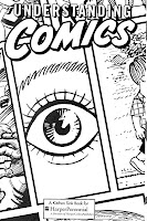 I found this piece of writing very interesting. I've had quite a connection between cartoons and comics and I guess I always image myself as those characters. When first reading this article I never really thought about different types of comics, I just never really thought about it. But when I think back on it their are tons of different types of comics. Ranging from Garfield to Marvel to Manga. I really like the idea for a cartoony detail for the people or characters with a detail background was really awesome looking.
 Source: Comic Cover
When I first saw the title "Understanding Comics" I instantly thought of Marvel Comics. I believe it to be one of the most famous comic book around. Just the incredible details in the background and into the characters really help me connect to the comic. Plus, with all the masks and secret identities really helps for the viewer to image him or herself as the characters.

Source: Garfield
Another comic that I thought of when I was reading the article was Garfield. It leans more over the side of Language and up towards the picture. But the comic is pretty simplistic and there's really not detail in the comic strip. But you can still figure out what the characters, objects, and the background are.

Typography for Children
 When I first started to read this I never read thought about the text they used in children books. I just always thought that they put something that looks good. I didn't realize that it could be difficult for children to read it if it's all stylized. But it was strict for children books to have very visible words for children to be able to read them. But there were still a lot of children books with illustrated titles.
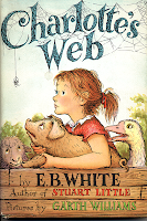 Source: Charlotte's Web
Charlotte's Web came to mind when I was thinking about books with illustrated titles. I love how the whole title is covered in webbing. Also, the spider hanging down from the beginning of the title was a nice touched.
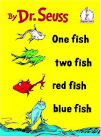 Source: Dr. Seuss
One children book series that did very well and still had a normal typography was the Dr. Seuss books. I didn't realize it but almost all of the book covers of Dr. Seuss' titles are very readable and had barely no illustration done with them. It's crazy because a lot of Dr. Seuss books have some crazy illustration art work in it but yet all the titles are normal lettering.
Sunday, January 24, 2010
Exercise One
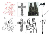
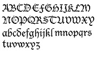 Black letter, also known as Gothic script or Gothic minuscule, was a script used throughout Western Europe from approximately 1150 to 1500. Carolingian minuscule was the direct ancestor of black letter. During this time their were new universities popping all over Europe and they needed copies of books. Unfortunately Carolinian minuscule took too long and took up too much space on the paper. So Black-letter was developed to solve these problems. During the 15th century many people described Black-letter as Gothic. Gothic was a synonym for barbaric.
I chose the images base on the fact that Black-letter was considered Gothic. So I chose a Gothic Church and a Gothic Cross. I also, recreated a map of Europe to show where black-letter came from and where it was used. The axe was a common weapon among barbarians, so I used that image because "Gothic" writing was considered barbaric.
The Swastika
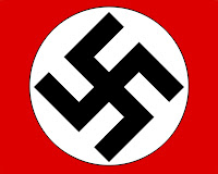
The Swastika was the most feared symbol during the 1930's to 1940's. It was adopted by one of the most feared and hated leaders mankind has ever known. But should the symbol itself take responsibility for being used in a madman's campaign for world domination. The origins of the swastika is mysterious and unknown. It maybe the oldest symbol that mankind has today dating back before Egyptian symbols. But what is known of the symbol, before Hitler adopted it as the symbol of the Nazis, it represented "good fortune" or "luck." It's pretty crazy that the symbol that everyone feared during WWII would mean something like "good fortune. Everyone knows this symbol to represent evil and hatred and it will always be remember as that because of an evil tyrant.
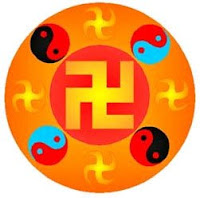
Source : Swastika 1
When I was looking up Swastika on the internet I came across this image. It does have the swastika in the middle of it but in this image the symbol looks less threatening and not as aggressive as the Nazi Swastika. They encase the swastika in a red circle but nly big enough for the symbol to just fit in it and the yin yang symbol helps the whole picture to have a peaceful feeling.
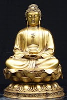
Source : Buddha with Swastika
I chose this image because it reminds me that the Swastika has a bigger meaning than that of the Nazi's. Buddha is a typical symbol of meditation, peace, honor, and enlightenment. It has no links to evil or hatred and the swastika symbol on his chest represents "good fortune" and "well being."
The Peace Symbol

This is the "Peace Symbol" used to represent anti-war activists. But exactly what does the symbol represent. I was shocked to learn what the designed symbol meant. In ancient times it was typical that a three prong symbol pointing downward meant "death of men" and derives from the story of Saint Peter being crucified upside down in the middle of Rome by Emperor Nero. It was then known as the "Nero Cross" or "Sign of the broken Jew." I was a little surprised about that but I was really surprised when I read that the guy who designed the "Peace Sign" was an anti-Christian and purposely chose the anti-Christian symbol that has been used in Satanism. I just blew my mind that the "Peace Sign", that represents good, peace, and love, was designed to mean something completely the opposite.

Source: Hand Peace Symbol
This just reminded me of another way to show peace is to extend your index and middle finger while folding your other fingers into you hand. This hand gesture is commonly used to show others that you come in "Peace."

Source: Upside Down Cross
This is an image of the upside down cross. I was reminded of this image because of the connection between the peace symbol and the upside down cross. But today the symbol is widely used in heavy metal bands or grunge music.
Monday, January 11, 2010
Paper Bombs
 The paper bombs article talked about armies in war using leaflets to terrorize or demoralize the enemy troops. For example the United States would drop millions of leaflets on their enemies with images of the power that the United States had and would write on them "You are going against the most feared and most powerful weapons the world has ever known". Before I read this I thought of war with tanks, guns, airplanes, and stuff like that. I would have never thought of dropping millions of paper to demoralize an army and to strike fear into them. Then I thought about how a nation would use this type of propaganda on an army that had the big bad weapons and sure enough it was already thought of. How crazy it would be out at war in another nation, eating MRI's for weeks or months, always on alert for when an attack might happen, having nobody but other soldiers around you in a country that more than likely doesn't want you there, and then finding a piece of paper with an image of an American family at home in there backyard grilling hamburgers or hot dogs, just enjoying being alive. Then reading the top of it saying, "You could be at home enjoying your life.......but instead your here in this hole." To me that's just some crazy psychological shit.
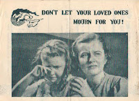
Source: http://www.psywarrior.com/
Creator: North Korea
This looks like a typical leaflet that the enemy would send to our troops. It has a picture of, I assume wife and daughter, and on the top of them the text reads, "Don't let your love ones mourn for you!" You can tell it is specifically made for Americans because the two girls in it look American.
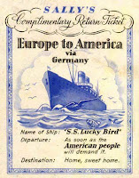
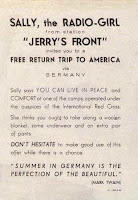
Source: http://www.psywarrior.com/
Creator: Germany
These two pictures are front and back and they are what they called "Complimentary Return Ticket." These were used typically during the world wars when America was involved in them. The front of the ticket has a picture of a luxury cruise and has writing that says, "Europe to America via Germany." Another leaflet made by Germans to guarantee a free pass back home on a luxury cruise.
Simplicissimus Poster
 The Simplicissimus Bulldog was the mascot of the rebel rebellion to the government of Germany back in 1900's. At first when I saw the image I didn't really think anything off it because I saw it first in black and white. But when I saw the image in color, I stared at it and the white eyes of the bulldog and the red body with the black background, it had a lot more impact than it did in black and white. I thought it was just crazy how the Nazi Germany took this already impacted image that the German people saw and made it into their own mascot or "lap dog".
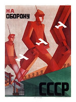 Source: http://sultanknish.blogspot.
Creator: Russia
A Russian poster with huge red troops and small white planes. This image reminded me of the Simplicissimus Bulldog by the geometric look of the soldiers and the different red color tones. Also, the whole tone of the poster gives like we are the Russians and our troops are huge and will crush you kind of feeling to the poster.
 Source: http://sultanknish.blogspot.
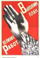
Creator: Russia
In this Russian Poster the meaning to it is that Georgia is a pawn of Britain and America and is being use to disrupt the peaceful Russians. The simplicity of have a huge hand going across the page with smaller hands underneath it and the bright red background reminded me the Simplicissimus Bulldog. The poster is very simply, bold, and to the point.
Subscribe to:
Comments (Atom)

