 When I first started to read this I never read thought about the text they used in children books. I just always thought that they put something that looks good. I didn't realize that it could be difficult for children to read it if it's all stylized. But it was strict for children books to have very visible words for children to be able to read them. But there were still a lot of children books with illustrated titles.
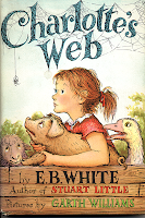
 Source: Charlotte's Web
Charlotte's Web came to mind when I was thinking about books with illustrated titles. I love how the whole title is covered in webbing. Also, the spider hanging down from the beginning of the title was a nice touched.
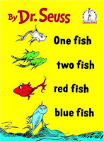
 Source: Dr. Seuss
One children book series that did very well and still had a normal typography was the Dr. Seuss books. I didn't realize it but almost all of the book covers of Dr. Seuss' titles are very readable and had barely no illustration done with them. It's crazy because a lot of Dr. Seuss books have some crazy illustration art work in it but yet all the titles are normal lettering.
No comments:
Post a Comment